
Project Details
Corteza
The position.
While at Common Thread Collective, Cheston and the brand team were working with an emerging premium skincare client. Entering the luxury space requires a unique style of communication. In order to speak to that audience, the brand needs to tell a story at every touchpoint which makes the product look millions of times more valuable than an average person may perceive it. Then, they need to make sure the product is also worth that price tag. We focus on the branding.
The problems.
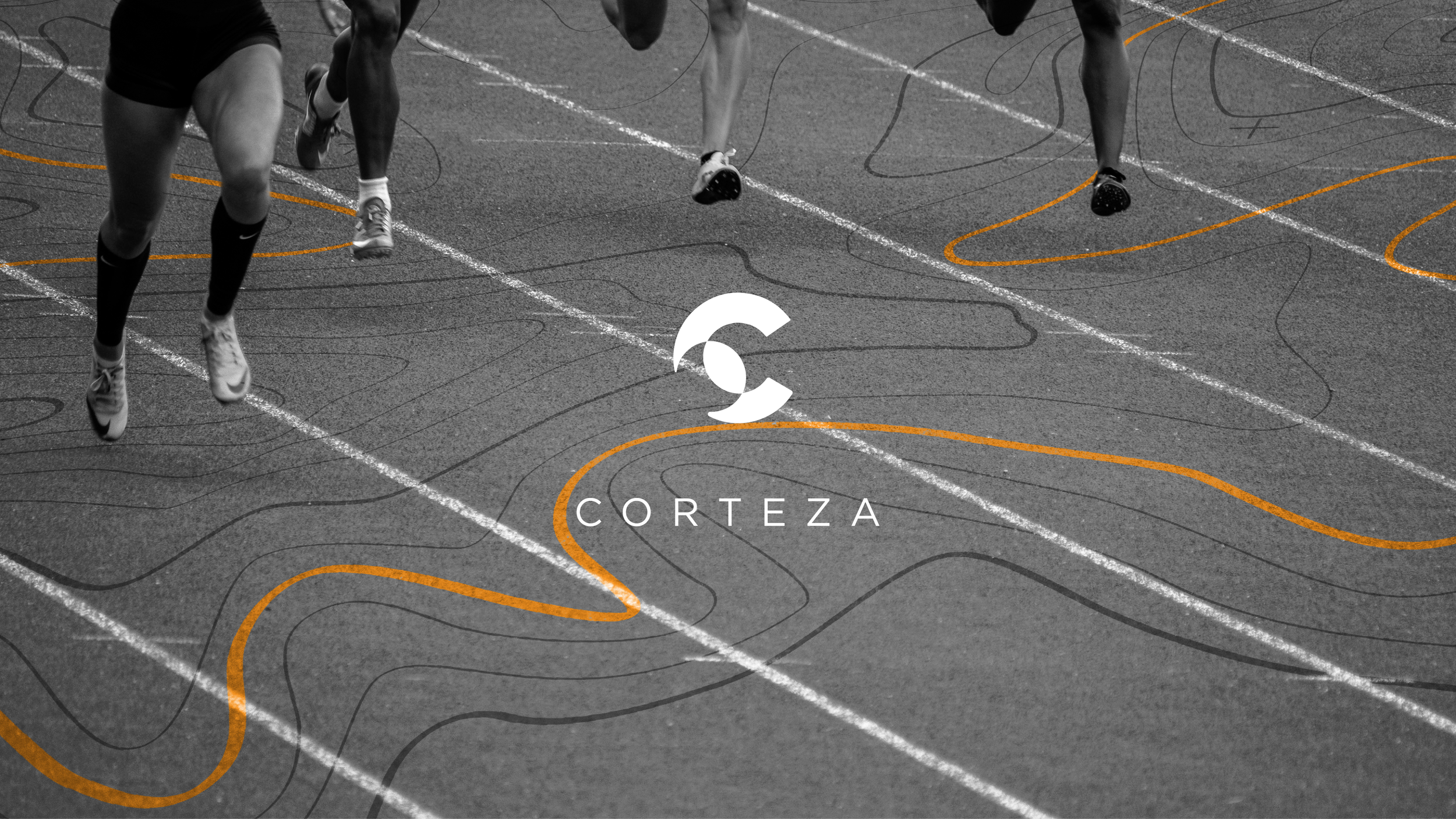
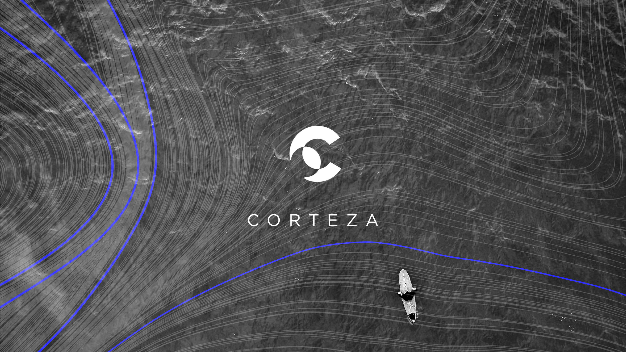
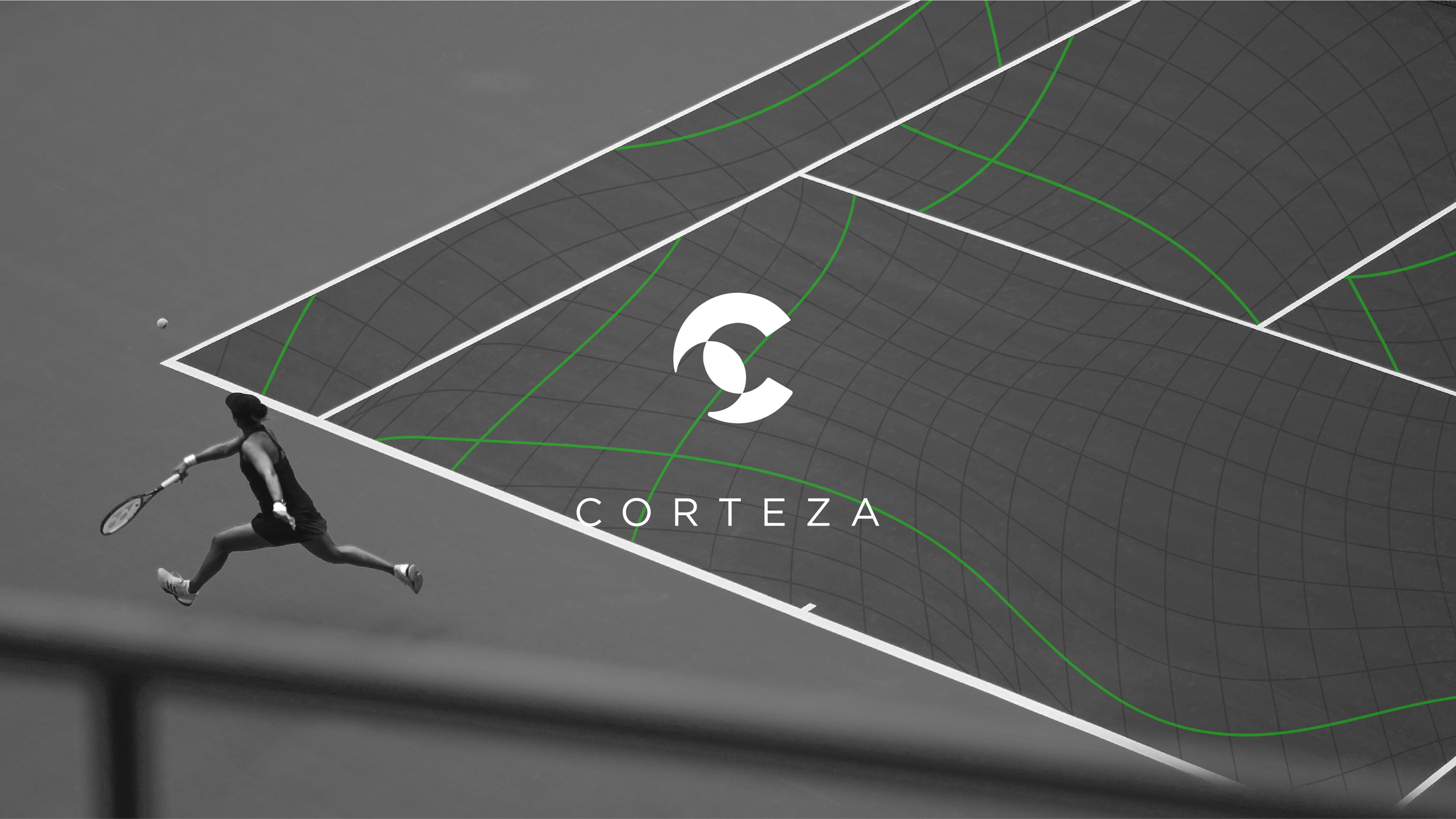
The company has five sunscreens that tailor specifically to different sports, and they wanted a different logo for each of the products. We wanted to keep all of the products under one umbrella concept. The client told us to stay as far away from the sun as possible; “We want to convey performance.”
The logo.
My original thoughts were to apply an unnoticeable, abstract concept of the sun to bring a minimalistic approach and provide a premium look. I loved the idea of balance and protection. I also loved the premium feel and boldness that comes from a letter logo mark. After many, many iterations we presented a few options to our client.
The identity.
We opted to created five different visual elements that would be supporting elements to the logo and overall brand. By doing so, we were able to bring a stronger story into each of the sport-specific sunscreens, and ultimately, strengthening the overall brand identity.
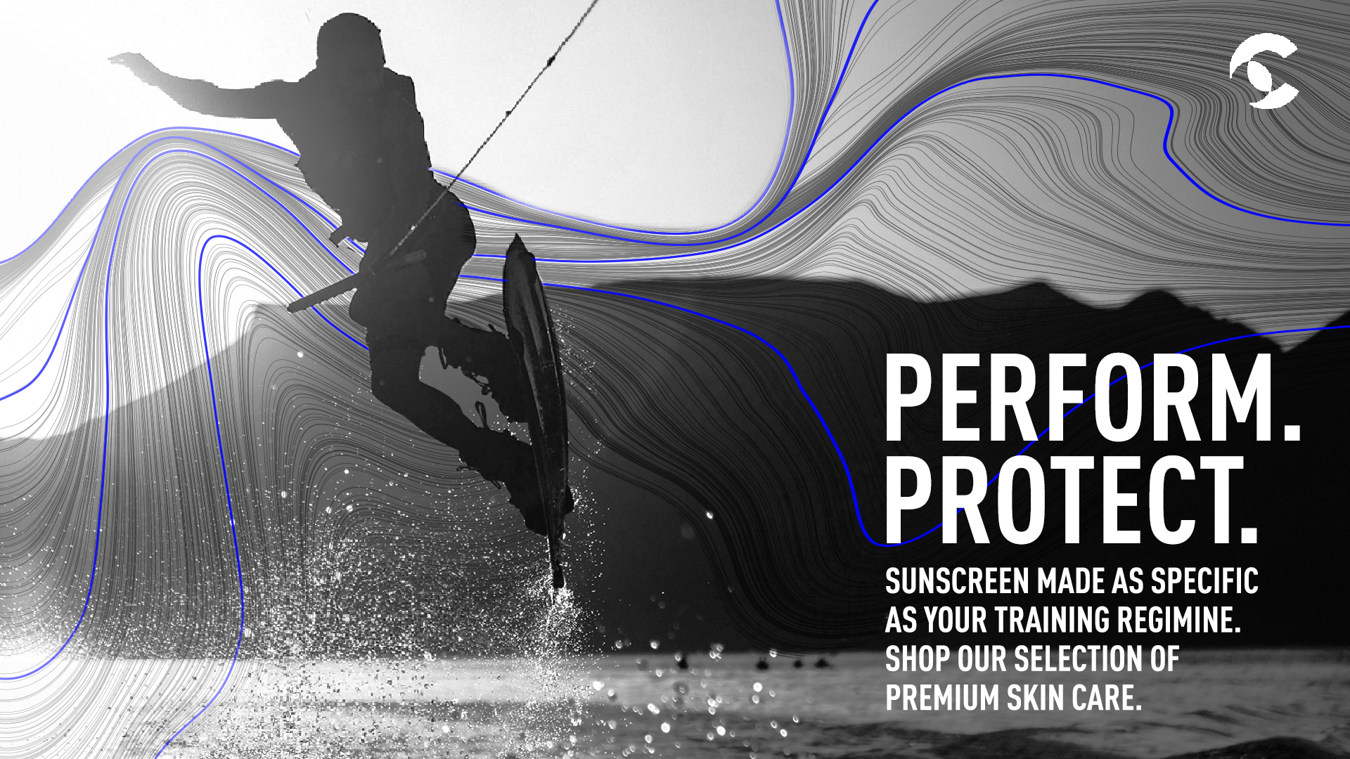
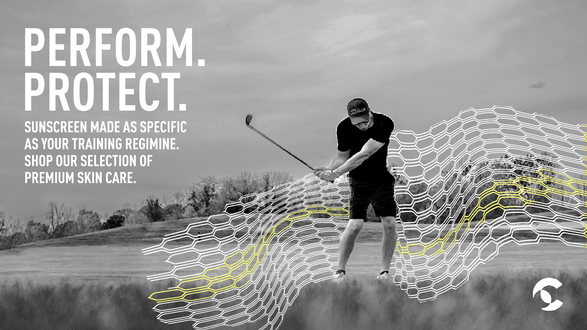
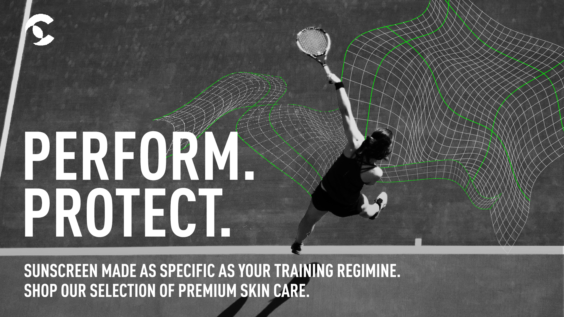
Luxury, technical skincare for high performance athletes.
/ logo
/ brand identity
/ copywriting